Luxury Redefined: The Glammed-Up Transformation of an SLS Lux Brickell Condo
- Billy De La Cruz
- Sep 26, 2023
- 3 min read
We’re beyond excited to spill the glittering beans on our latest project - a dazzling renovation at the iconic SLS Lux Brickell Residences!
Prepare to be swept off your feet as we share the journey of transforming this condo into a glamorous haven that is elevated and sophisticated, just like the client wanted.

Buuutttt, before we talk about the end result, let's go back a bit! Initially, the space lacked personality, had lots of blank walls and builder grade EVERYTHING! However, that wasn't so bad as it gave us a blank canvas to work with. Check out these before pics!
First impressions matter, right?! The entryway of a home is the first room your guests see and sets the tone for the rest of the spaces. An entryway is a place to welcome guests, store shoes and coats, and showcase your style. With this project, we wanted to ensure that the entryway was functional as well as visually appealing. We removed all of the picture frames and instead opted for a digital picture frame (not pictured here) that can store over 1,000 photos and did not take up much space. The linen credenza serves as storage. We added art, a table lamp, and a catchall bowl in the middle.
Take a slider peek-a-boo look below at this before and after!
Luxe Meets Lifestyle
The SLS Lux Brickell Residences already exude an air of exclusivity, but we wanted to take it a notch higher. Our design mantra was simple - intertwining glamour with functionality. From lavish chandeliers to plush velvet furnishings, we blended sumptuous elements seamlessly with a layout that caters to modern-day urban living.

If you are as obsessed with this space as we are, feel free to check out some of the products we used below!
Our approach was to harmonize comfort and elegance. We introduced custom board and batten on the walls to give the entire apartment an entirely new feel (walls tend to do that). And then we added in lush seating areas, boasting a balance of soft textures and bold colors, inviting you to sink into luxury after a long day. The blend of glamorous accents and cozy corners creates an inviting atmosphere that’s sure to impress both residents and guests alike.

Tile Talk
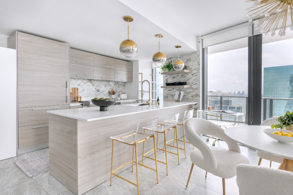
Let's talk about this backsplash tile we selected! This Audrey Lane Joni Sunset hex tile is GORGEOUS. It’s neutral off-white background and swirls of grey, blue, and gold make it a winner.


Shop this epic kitchen here!
Illuminating the Space
Lighting is the key to accentuating glamour, and we made sure to light up this space like a star-studded sky. Crystal-laden chandeliers and sleek, modern fixtures are strategically placed to create a mesmerizing play of light and shadow, adding that extra oomph to every corner.

Wallpaper Wonders!
Adding wallpaper in a powder bathroom is always a great idea. A powder bathroom is typically a small space and adding wallpaper is a small, but impactful way to add personality, color and texture to the space. Here we added a bold deep navy banana leaf wallpaper from Graham & Brown. We paired that with black and brass accents for the cherry on top!

We wanted to take an opportunity to give a huge thanks to GK Construction for their exceptional work on this project. Their professionalism, craftsmanship, and dedication truly made a difference. Efrain and his team are truly set apart. If you are looking for a local Miami GC, we wholeheartedly recommend them!
Needless to say, this project has been a labor of love, and we couldn’t be happier with the results!


Comments